plotnine-gallery-aez
![]()
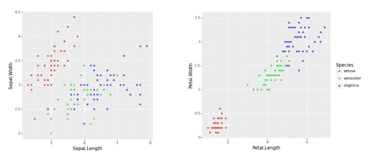
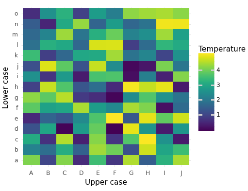
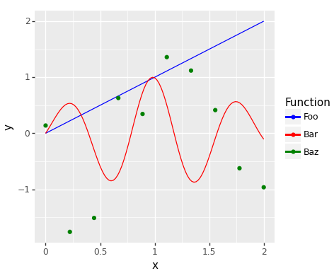
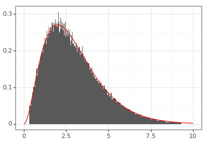
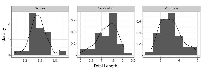
Figure 1
Keywords: combining plots
import matplotlib.pyplot as plt
import matplotlib.image as mpimg
import matplotlib as matplotlib
matplotlib.use('QtAgg')
import pandas as pd
import plotnine as p9
from plotnine import ggplot, geom_point, aes, theme


iris = pd.read_csv("iris.csv")

plot1 = (ggplot()
     + geom_point(data = iris,
                  mapping = aes(x = "Sepal.Length",
                                y = "Sepal.Width",
                                colour = "Species"))
     + theme(legend_position = "none"))

plot2 = (ggplot()
     + geom_point(data = iris,
                  mapping = aes(x = "Petal.Length",
                                y = "Petal.Width",
                                colour = "Species")))

plot1.save("plot1.png", width=5, height=5)
plot2.save("plot2.png", width=6, height=5)
img1 = mpimg.imread('plot1.png')
img2 = mpimg.imread('plot2.png')

fig, axs = plt.subplots(1, 2, gridspec_kw={'width_ratios': [1, 1.2]})
axs[0].imshow(img1)
axs[0].axis('off')
axs[1].imshow(img2)
axs[1].axis('off')
plt.savefig("fig01.png", dpi=300, bbox_inches='tight')
Figure 2
Keywords: heatmap, matrix, tile geometry
import matplotlib.pyplot as plt
import matplotlib.image as mpimg
import matplotlib as matplotlib
matplotlib.use('QtAgg')
from plotnine import ggplot, aes, geom_tile, labs, theme_minimal
import pandas as pd
import numpy as np

# Creating the data
x = list('ABCDEFGHIJ')
y = list('abcdefghijklmno')
plot_df = pd.DataFrame(
    {'x': np.tile(x, len(y)),
     'y': np.repeat(y, len(x)),
     'z': np.random.uniform(0, 5, len(x) * len(y))})

# Creating the plot
example_plot = (ggplot() +
                geom_tile(data=plot_df,
                          mapping=aes(x='x', y='y', fill='z')) +
                labs(x='Upper case',
                     y='Lower case',
                     fill='Temperature') +
                theme_minimal())

fig = example_plot.draw()
fig.set_facecolor('white')
fig.set_size_inches(13 / 2.54, 10 / 2.54)
fig.savefig("fig02.png")
Figure 3
Keywords: function, curve, expression, colours
import matplotlib.pyplot as plt
import matplotlib.image as mpimg
import matplotlib as matplotlib
matplotlib.use('QtAgg')
from plotnine import ggplot, aes, stat_function, geom_point, scale_colour_manual
import pandas as pd
import numpy as np

# Function for the first line (identity function)
def identity(x):
    return x

# Function for the second line
def custom_function(x):
    return np.exp(-(x - 1)**2) * np.sin(x * 8)

# Data for the scatter plot
scatter_data = pd.DataFrame({
    'x': np.linspace(0, 2, 10),
    'y': np.random.normal(size = 10)
})

example_plot = (ggplot(pd.DataFrame({'x': [0, 2]}), aes('x')) +
                stat_function(fun = identity,
                              geom = 'line',
                              mapping = aes(colour = '"Foo"')) +
                stat_function(fun = custom_function,
                              geom = 'line',
                              mapping = aes(colour = '"Bar"')) +
                geom_point(data = scatter_data,
                           mapping = aes(colour = '"Baz"', y = 'y')) +
                scale_colour_manual(name = "Function",
                                    values = {"Foo": "blue",
                                              "Bar": "red",
                                              "Baz": "green"}))


fig = example_plot.draw()
fig.set_facecolor('white')
fig.set_size_inches(12 / 2.54, 10 / 2.54)
fig.savefig("fig03.png")
Figure 4
Keywords: credible intervals, confidence intervals, pandas, density
import matplotlib.pyplot as plt
import matplotlib.image as mpimg
import matplotlib as matplotlib
matplotlib.use('QtAgg')
from plotnine import *
import pandas as pd
import numpy as np
import scipy.stats

def plottable_ci_df(model_ci_df):
    """
    Converts the model_cints table into a dataframe that can be
    plotted using plot9.

    Assumes that the model_cints table has the following columns:
    - prob (as a percentage)
    - ymin
    - ymax

    Returns a dataframe with the following columns:
    - prob
    - mass
    - ymin
    - ymax
    """
    assert model_ci_df['prob'].dtype == int
    dd = sorted(model_ci_df.to_dict(orient= 'records'),
                key=lambda k: k['prob'])

    left_blocks, right_blocks = [], []
    prev_prob = 0
    probs = [d['prob'] for d in dd]
    start_prob = np.array(probs).min()

    for prob in probs:
        di = [d for d in dd if d['prob'] == prob][0]
        left_block_right = (0.5 * ( di['ymin'] + di['ymax'] )
                            if prob == start_prob
                        else left_blocks[-1]['ymin'])
        di_left = {'prob': di['prob'],
                   'mass': 0.5 * (di['prob'] / 100 - prev_prob / 100),
                   'ymax': left_block_right,
                   'ymin': di['ymin']}
        left_blocks.append(di_left)
        right_block_left = (0.5 * ( di['ymin'] + di['ymax'] )
                        if prob == start_prob
                        else right_blocks[-1]['ymax'])
        di_right = {'prob': di['prob'],
                    'mass': 0.5 * (di['prob'] / 100 - prev_prob / 100),
                    'ymax': di['ymax'],
                    'ymin': right_block_left}
        right_blocks.append(di_right)
        prev_prob = di['prob']

    tmp = pd.concat([pd.DataFrame(left_blocks),
                     pd.DataFrame(right_blocks)])
    tmp['xmin'] = 0
    tmp['xmax'] = tmp['mass'] / (tmp['ymax'] - tmp['ymin'])
    return tmp

gamma_dist = scipy.stats.gamma(3)

# Construct approximate density based on central credible intervals.
gamma_rvs = gamma_dist.rvs(size = 100000)
cov_prct = np.linspace(1, 99, 99)
ci_lower = np.percentile(gamma_rvs, cov_prct / 2)
ci_upper = np.percentile(gamma_rvs, 100 - cov_prct / 2)
gamma_ci_df = pd.DataFrame({'prob': np.flip(cov_prct).astype(int),
                            'ymin': ci_lower,
                            'ymax': ci_upper})
plt_df_1 = plottable_ci_df(gamma_ci_df)

# Construct exact density.
xs = np.linspace(0, 10, 1000)
ys = gamma_dist.pdf(xs)
plt_df_2 = pd.DataFrame({'x': xs, 'y': ys})

demo_p9 = (ggplot()
           + geom_rect(data = plt_df_1,
                       mapping = aes(xmin = 'ymin',
                                     xmax = 'ymax',
                                     ymin = 'xmin',
                                     ymax = 'xmax'))
           + geom_line(data = plt_df_2,
                       mapping = aes(x = 'x', y = 'y'),
                       color = 'red')
           + theme_bw()
           + theme(axis_title = element_blank())
           )

demo_p9.save("fig04.png", height = 2.9, width = 4.1)
Figure 5
Keywords: facet labeller, title case, density
import matplotlib.pyplot as plt
import matplotlib.image as mpimg
import matplotlib as matplotlib

matplotlib.use("QtAgg")
from plotnine import *
import pandas as pd
import numpy as np
import scipy.stats

iris = pd.read_csv("iris.csv")


def my_labeller(label: str) -> str:
    return label.title()


demo_p9 = (
    ggplot(iris, aes(x="Petal.Length", y="..density.."))
    + geom_histogram(bins=7)
    + geom_density()
    + facet_wrap("Species", scales="free", labeller=my_labeller)
    + theme_bw()
)

demo_p9.save("fig05.png", height=2.9, width=8.1)