matplotlib gallery
![]()
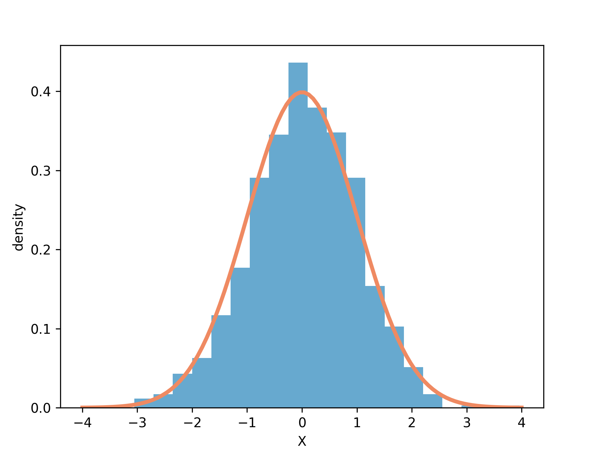
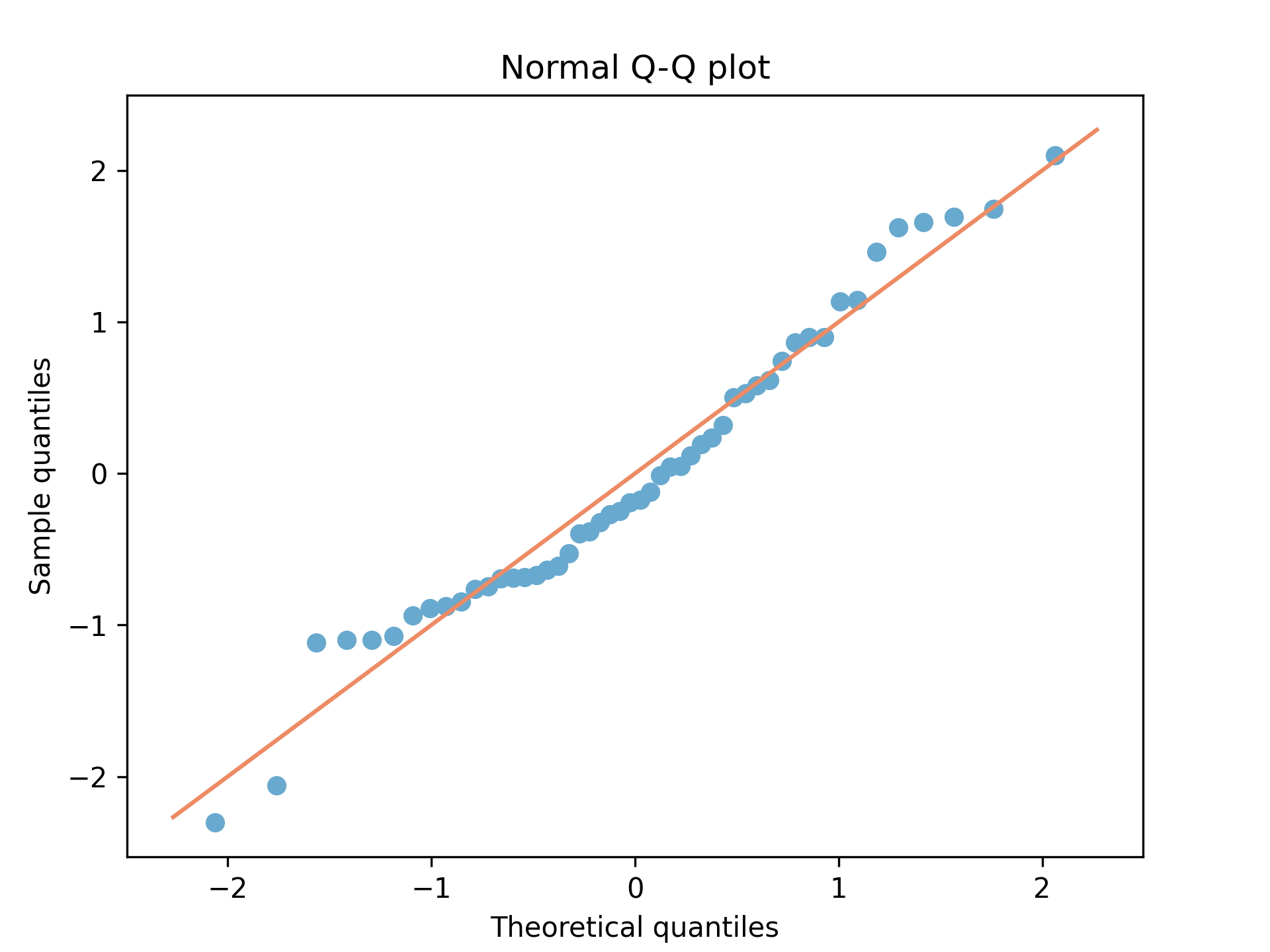
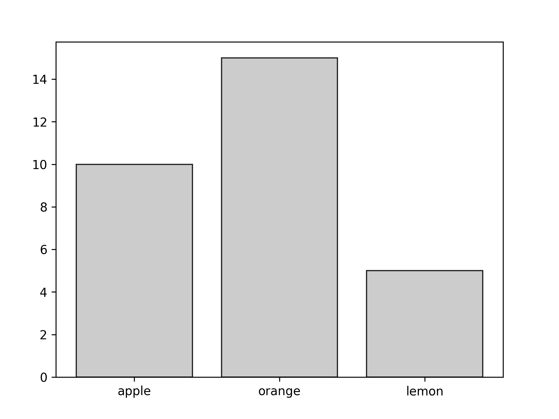
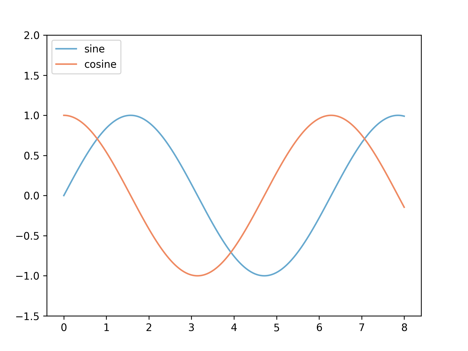
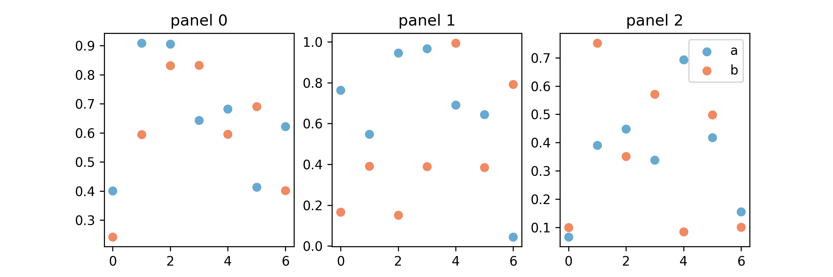
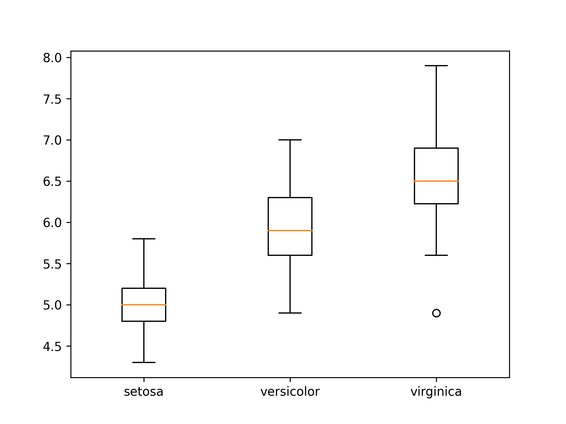
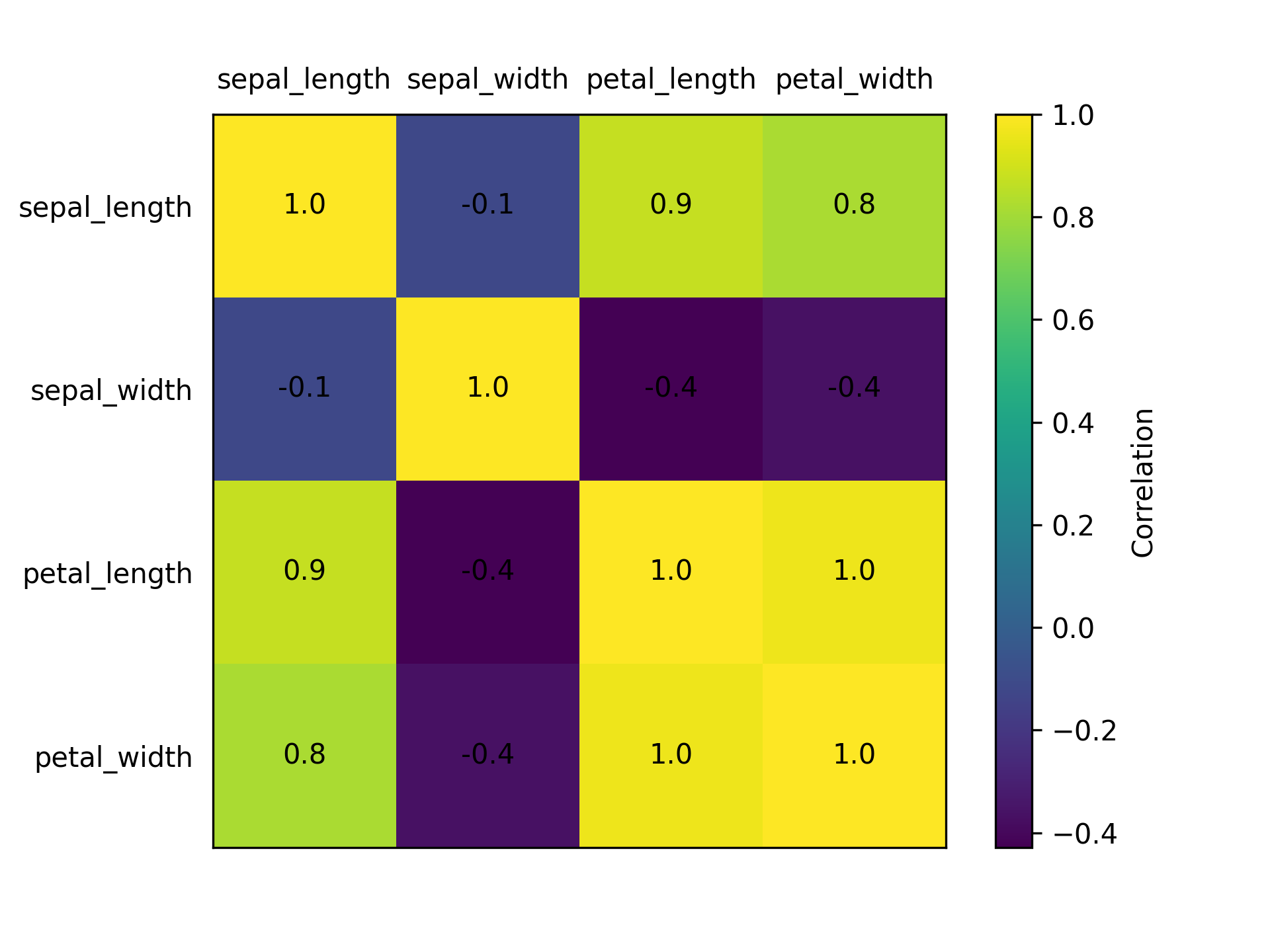
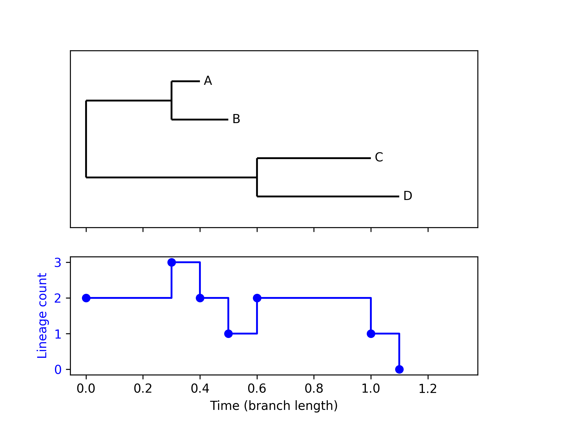
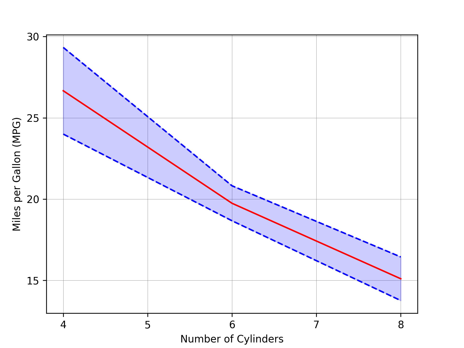
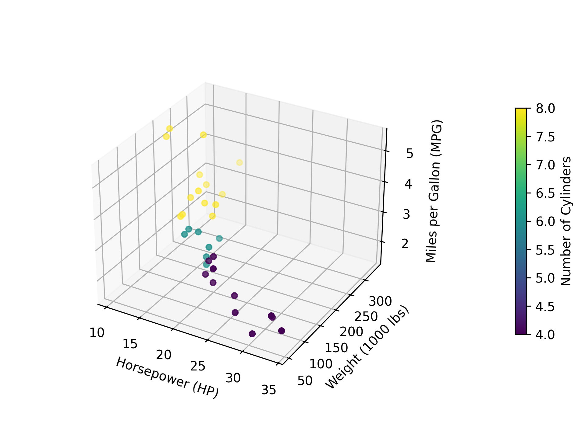
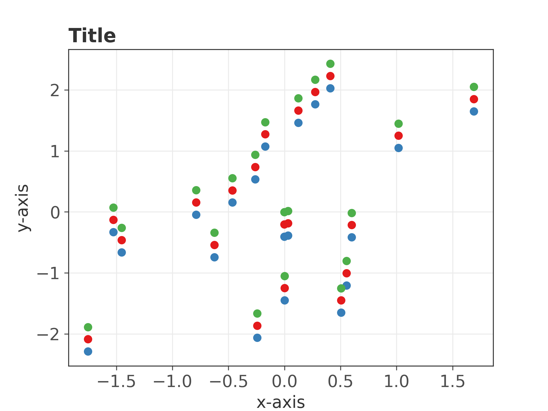
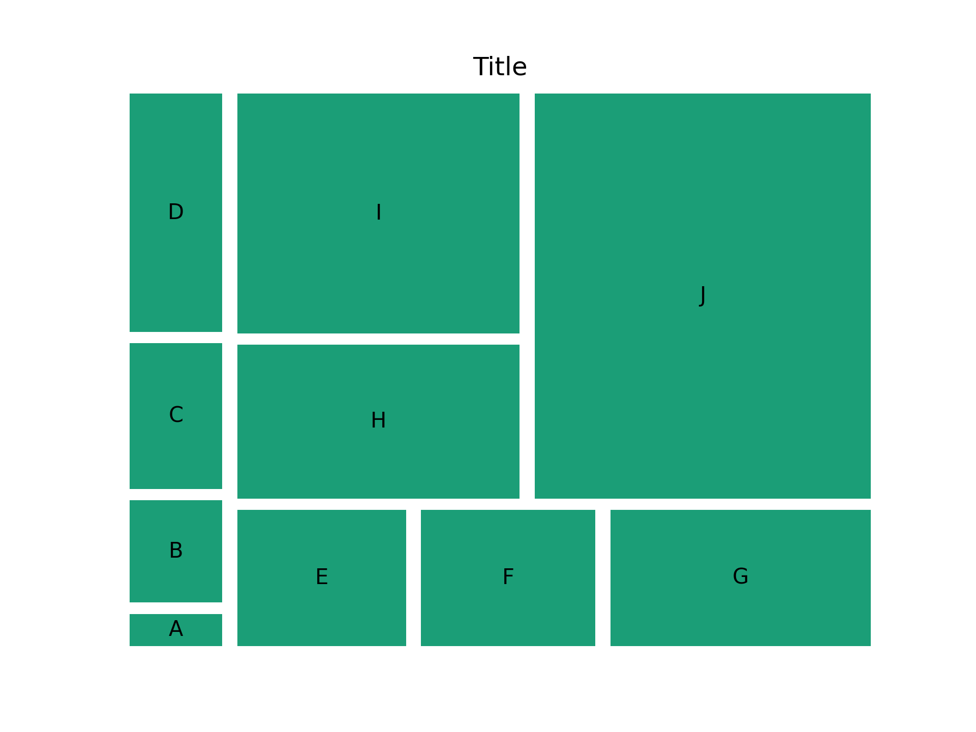
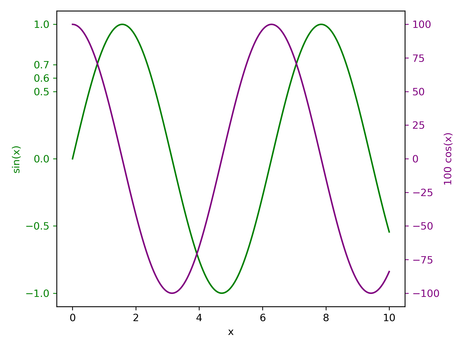
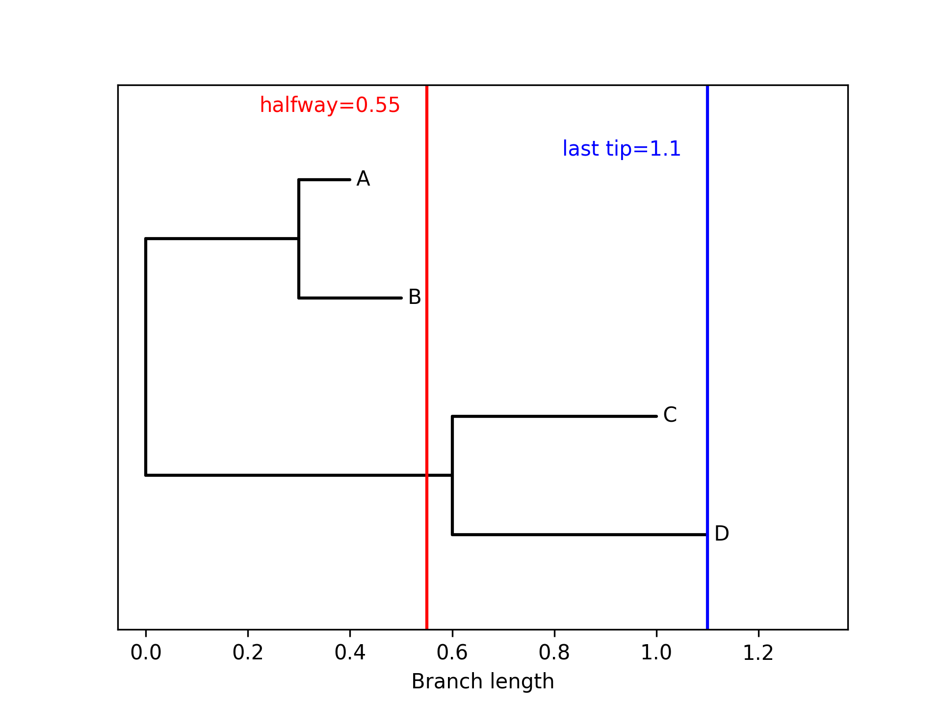
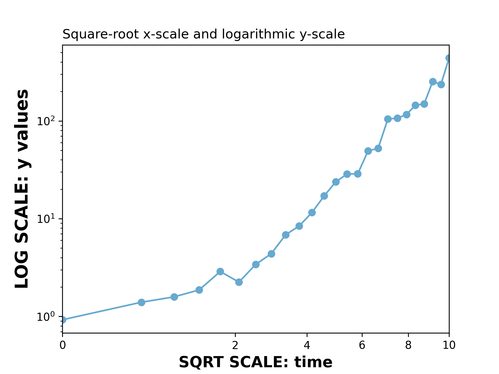
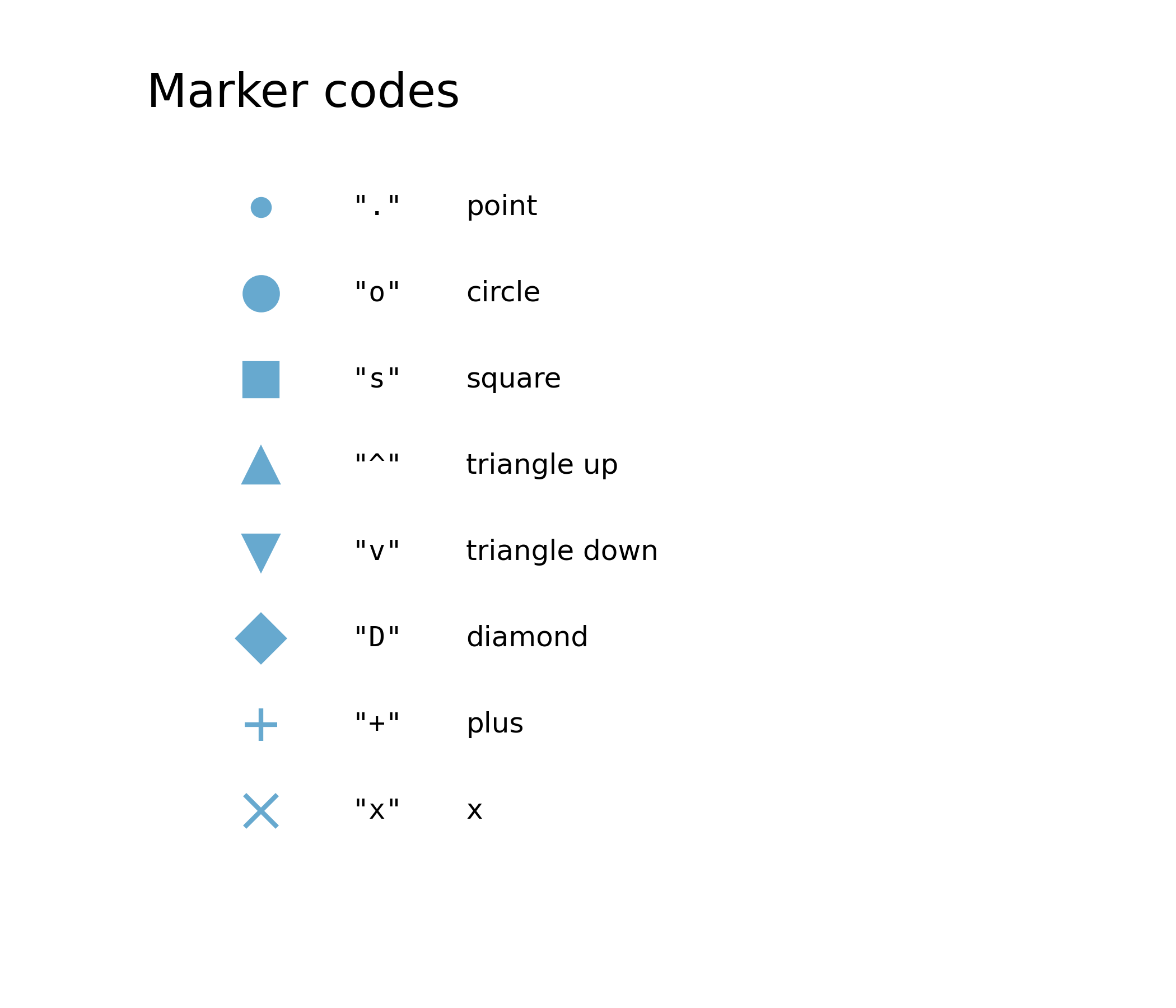
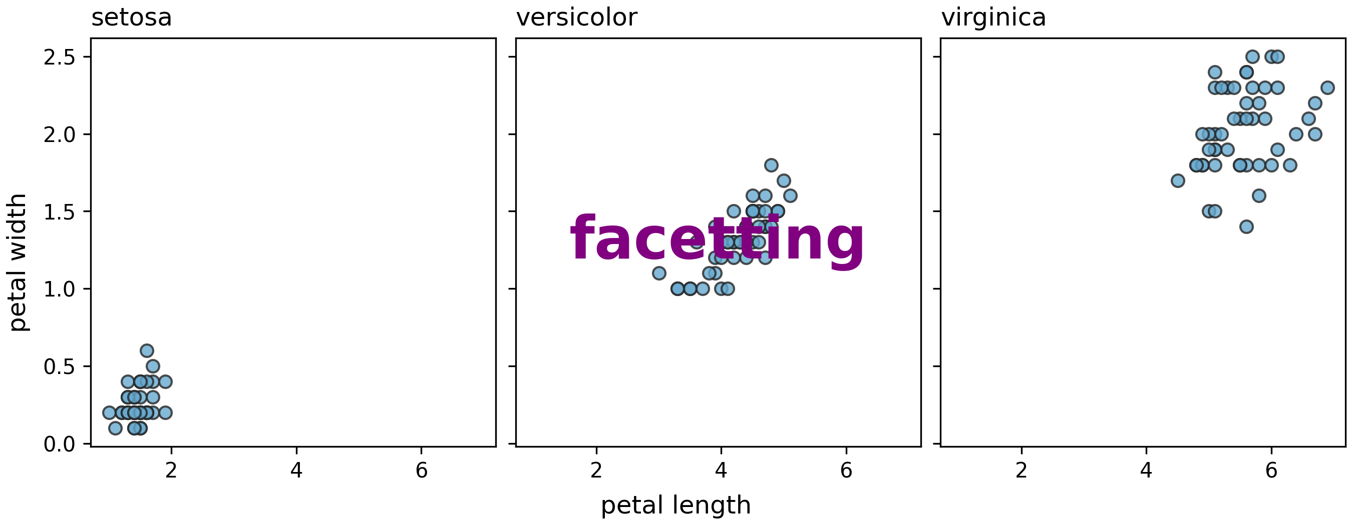
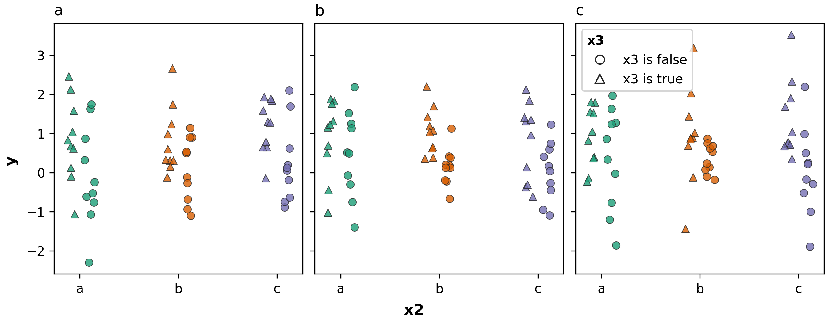
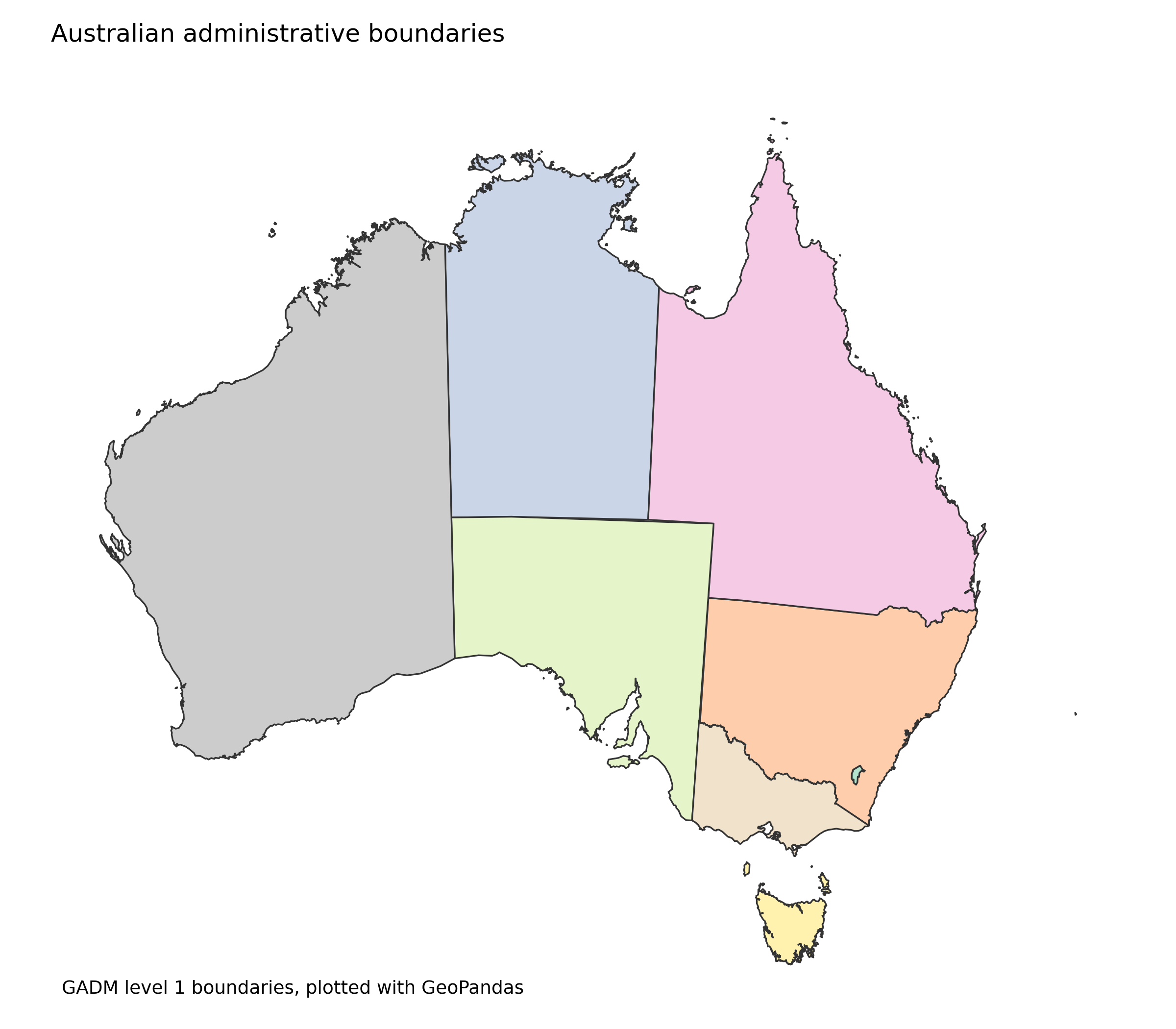
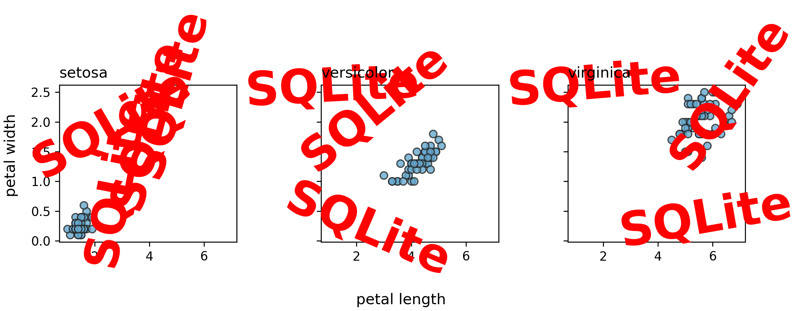
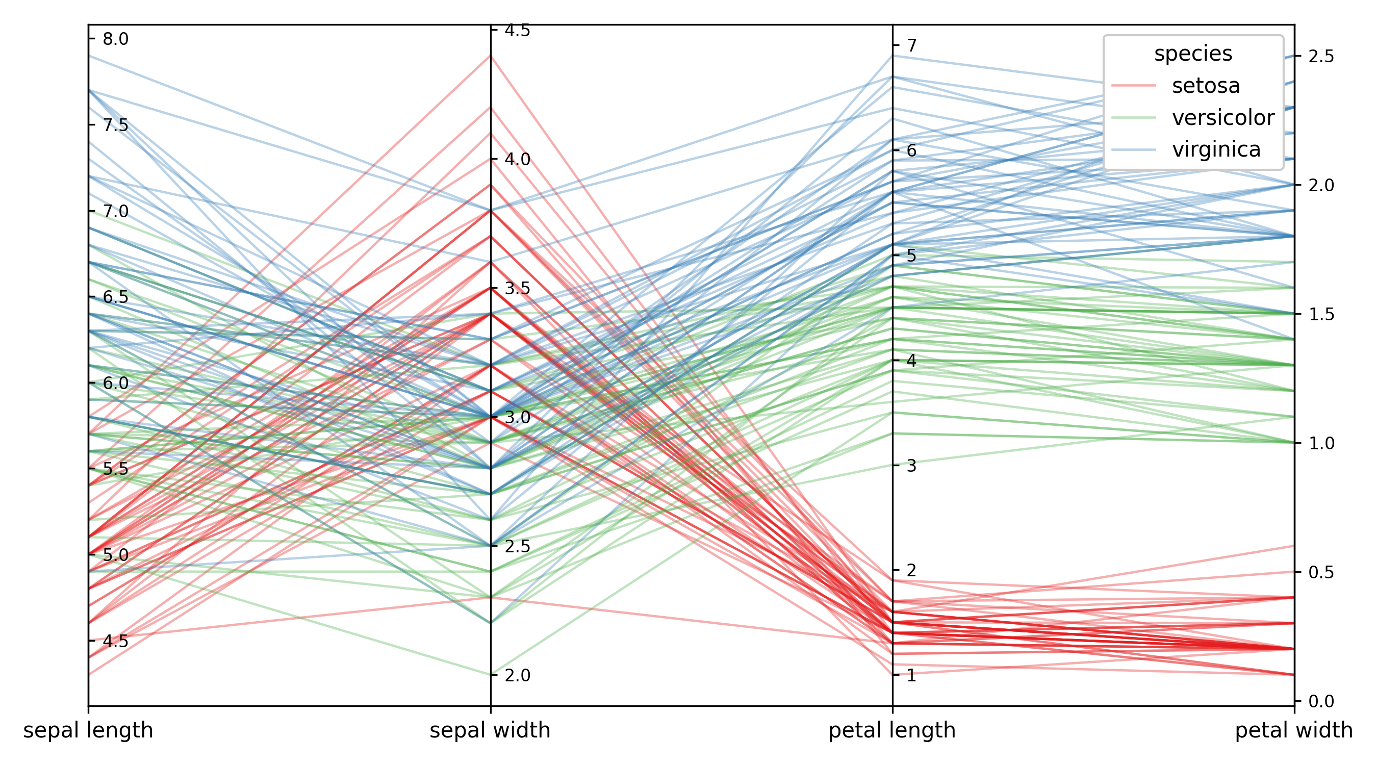
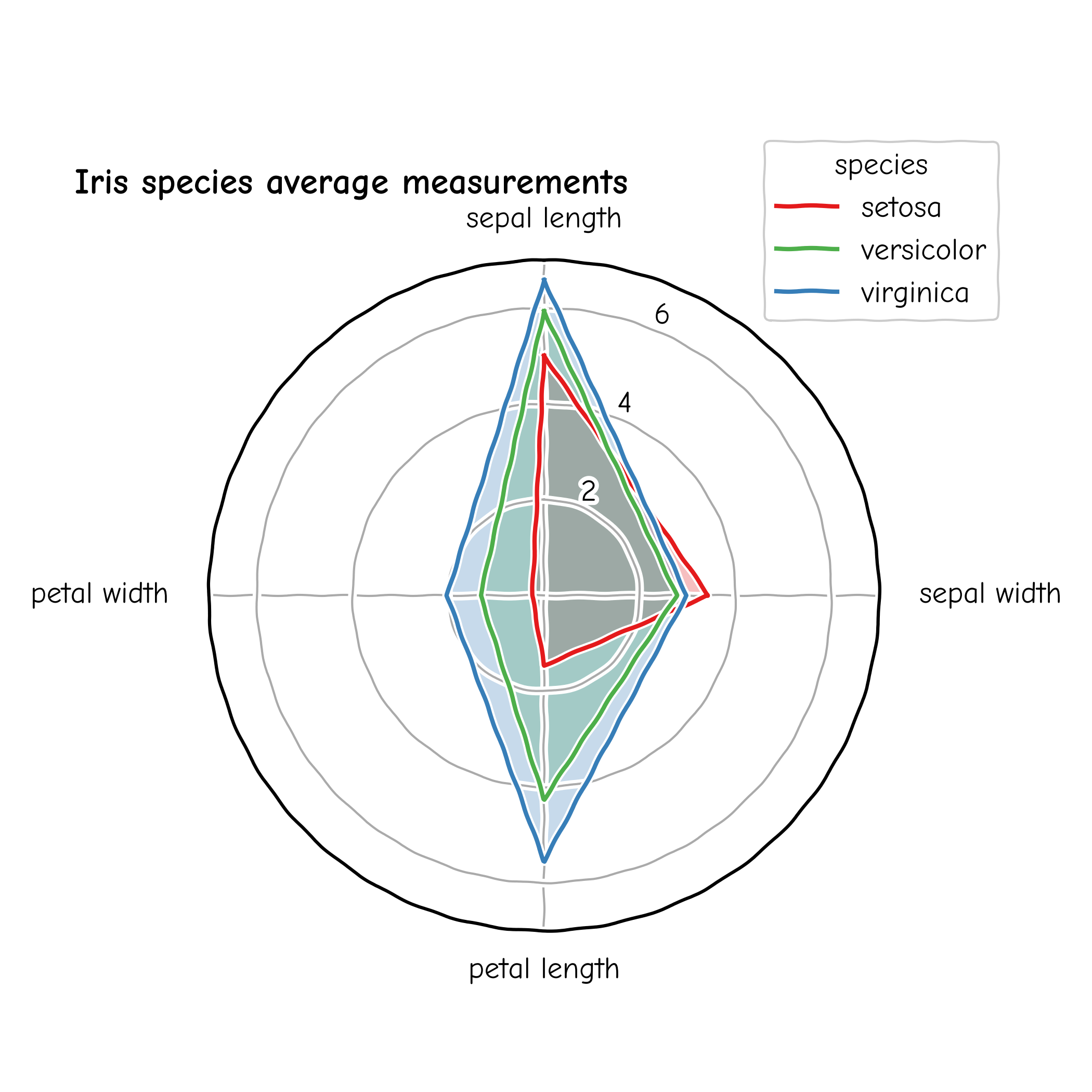
Figure 1
import matplotlib.pyplot as plt
import numpy as np

np.random.seed(1)
x = np.random.randn(1000)
x_mesh = np.linspace(start = -4, stop = 4, num = 100)
y = np.exp(-0.5 * x_mesh ** 2) / np.sqrt(2 * np.pi)

fig = plt.figure()
ax = fig.add_axes([0.1,0.1,0.8,0.8])
ax.hist(x, bins = 20, density=True, color="#67a9cf")
ax.plot(x_mesh, y, color="#ef8a62", linewidth=3)
ax.set_xlabel("X")
ax.set_ylabel("density")

fig.savefig("fig01.png", dpi=300)
Figure 2
import matplotlib.pyplot as plt
import numpy as np
import scipy.stats as stats

np.random.seed(1)
num_points = 50
x = np.random.randn(num_points)
x.sort()

unit_mesh = np.linspace(
    start = num_points / (num_points + 1),
    stop = 1 / (num_points + 1),
    num = num_points)
quantile_vals = stats.norm.isf(unit_mesh)

line_lims = [min(quantile_vals) * 1.1,max(quantile_vals) * 1.1]

fig = plt.figure()
ax = fig.add_axes([0.1,0.1,0.8,0.8])
ax.scatter(quantile_vals, x, color="#67a9cf")
ax.plot(line_lims, line_lims, color="#ef8a62")
ax.set_title("Normal Q-Q plot")
ax.set_xlabel("Theoretical quantiles")
ax.set_ylabel("Sample quantiles")

fig.savefig("fig02.png", dpi=300)
Figure 3
import matplotlib.pyplot as plt

data = {'apple': 10, 'orange': 15, 'lemon': 5}
names = list(data.keys())
values = list(data.values())

fig = plt.figure()
ax = fig.add_axes([0.1,0.1,0.8,0.8])
ax.bar(names,
       values,
       color = "#cccccc",
       edgecolor = "#252525")

fig.savefig("fig03.png", dpi=300)
Figure 4
import numpy as np
import matplotlib.pyplot as plt

x = np.linspace(0, 8, 1000)
y1 = np.sin(x)
y2 = np.cos(x)

fig, ax = plt.subplots()
ax.plot(x, y1, color="#67a9cf", label="sine")
ax.plot(x, y2, color = "#ef8a62", label="cosine")
ax.legend(loc="upper left")
ax.set_title("Lines and Ticks", loc="left")
ax.set_xlabel("x")
ax.set_ylabel("value")
ax.set_xticks([0, 1, 2, 4, 7, 8])
ax.set_ylim([-1.5, 2.5])
ax.set_yticks(np.linspace(-1.5, 1.5, 7))

fig.savefig("fig04.png", dpi=300)
Figure 5
import numpy as np
import matplotlib.pyplot as plt

np.random.seed(4)

fig, axs = plt.subplots(2, 2, figsize=(8, 6), constrained_layout=True)

xs = np.arange(7)
groups = list(zip(["a", "b"], ["#67a9cf", "#ef8a62"]))

for ax, title in zip(axs[0], ["scatter panel 1", "scatter panel 2"]):
    for group, color in groups:
        ys = np.random.uniform(size=7)
        ax.scatter(xs, ys,
                   edgecolors = color,
                   facecolors = "none",
                   label = group)
    ax.set_title(title, loc = "left")
    ax.set_ylim([0, 1])
    ax.set_xlim([-0.5, 6.5])
    ax.set_xlabel("shared x")

axs[0, 0].set_ylabel("shared y")
axs[0, 1].legend(loc = "upper right")

line_xs = np.linspace(0, 2 * np.pi, 100)
axs[1, 0].plot(line_xs, np.sin(line_xs), color = "#67a9cf")
axs[1, 0].set_title("line plot")
axs[1, 0].set_xlabel("angle")
axs[1, 0].set_ylabel("sin(x)")

samples = np.random.normal(size=500)
axs[1, 1].hist(samples, bins = 20, color = "#ef8a62", edgecolor = "purple")
axs[1, 1].set_title("histogram", loc="right")
axs[1, 1].set_xlabel("value")
axs[1, 1].set_ylabel("count")

for label, ax in zip(["A", "B", "C", "D"], axs.flat):
    ax.text(-0.15, 1.15, label,
            transform = ax.transAxes,
            fontsize = 14,
            fontweight = "bold",
            va = "top",
            ha = "left")

fig.savefig("fig05.png", dpi=300)
Figure 6
import matplotlib.pyplot as plt
import pandas as pd

iris = pd.read_csv("iris.csv")
unique_species = iris.species.unique()
grouped_sepal_lengths = [iris[iris.species == species].sepal_length
                         for species in unique_species]

plt.figure()
plt.boxplot(x = grouped_sepal_lengths,
            labels = unique_species)
plt.savefig("fig06.png", dpi=300)
Figure 7
import matplotlib.pyplot as plt
import matplotlib as matplotlib
import pandas as pd

iris = pd.read_csv("iris.csv")
numeric_cols = iris.columns.to_list()[0:4]
iris_corrs = iris[numeric_cols].corr().to_numpy()

fig, ax = plt.subplots()
im = ax.imshow(iris_corrs)
cbar = ax.figure.colorbar(im)
cbar.ax.set_ylabel("Correlation")
ax.set_xticks(range(iris_corrs.shape[1]))
ax.set_yticks(range(iris_corrs.shape[0]))
ax.set_xticklabels(numeric_cols)
ax.set_yticklabels(numeric_cols)
ax.tick_params(top=False, bottom=False,
               labeltop=True, labelbottom=False)

kw = dict(horizontalalignment="center",
          verticalalignment="center",
          color="black")
valfmt = matplotlib.ticker.StrMethodFormatter("{x:.1f}")

for i in range(iris_corrs.shape[0]):
    for j in range(iris_corrs.shape[1]):
        im.axes.text(j, i, valfmt(iris_corrs[i, j], None), **kw)

plt.tick_params(left=False)
plt.savefig("fig07.png", dpi=300)
Figure 8
from Bio import Phylo
from io import StringIO
import matplotlib.pyplot as plt
import numpy as np


def ltt_data(tree):
    node_times = []
    def traverse(clade, current_time):
        bl = clade.branch_length if clade.branch_length else 0
        if clade.clades:
            node_times.append(('branch', current_time))
        for child in clade.clades:
            if child.is_terminal():
                node_times.append(('tip', current_time + child.branch_length))
            else:
                traverse(child, current_time + child.branch_length)
    traverse(tree.root, 0)
    times = []
    num_lines = []
    curr_ltt = 1
    for (node_type, time) in node_times:
        times.append(time)
        if node_type == 'branch':
            curr_ltt += 1
            num_lines.append(curr_ltt)
        else:
            curr_ltt -= 1
            num_lines.append(curr_ltt)
    return times, num_lines


newick_tree = StringIO("((A:0.1, B:0.2):0.3, (C:0.4, D:0.5):0.6);")
tree = Phylo.read(newick_tree, "newick")

fig, (ax1, ax2) = plt.subplots(2, 1, sharex=True, gridspec_kw={'height_ratios': [3, 2]})

Phylo.draw(tree, do_show = False, axes = ax1)
ax1.yaxis.set_ticks([])
ax1.yaxis.set_ticklabels([])
ax1.set_ylabel('')
ax1.set_xlabel('')

ltt_x, ltt_y = ltt_data(tree)
ax2.plot(ltt_x, ltt_y, 'bo')
ax2.step(ltt_x, ltt_y, 'b-', where='post', label='Sine Wave')
ax2.set_ylabel('Lineage count', color='b')
ax2.set_xlabel('Time (branch length)')
ax2.tick_params(axis='y', labelcolor='b')

plt.subplots_adjust(right=0.85)
fig.savefig("fig08.png", dpi=300)
Figure 9
import pandas as pd
import numpy as np
import matplotlib.pyplot as plt


mtcars = pd.read_csv("mtcars.csv")


plot_df = (
    mtcars.groupby("cyl")
    .agg(
        mean_mpg=("mpg", "mean"),
        sd_mpg=("mpg", "std"),
        n=("mpg", "size"),  # Count the number of occurrences for each group
    )
    .reset_index()
)

plot_df["lower_mpg"] = plot_df["mean_mpg"] - 1.96 * plot_df["sd_mpg"] / np.sqrt(
    plot_df["n"]
)
plot_df["upper_mpg"] = plot_df["mean_mpg"] + 1.96 * plot_df["sd_mpg"] / np.sqrt(
    plot_df["n"]
)


fig = plt.figure()
ax = fig.add_axes([0.1, 0.1, 0.8, 0.8])
ax.fill_between(
    plot_df["cyl"], plot_df["lower_mpg"], plot_df["upper_mpg"], color="blue", alpha=0.2
)
ax.plot(plot_df["cyl"], plot_df["lower_mpg"], "--", color="blue")
ax.plot(plot_df["cyl"], plot_df["upper_mpg"], "--", color="blue")
ax.plot(plot_df["cyl"], plot_df["mean_mpg"], "-", color="red", label="Mean")
ax.set_xlabel("Number of Cylinders")
ax.set_ylabel("Miles per Gallon (MPG)")
ax.set_xticks(range(4, 9))
ax.set_yticks(range(15, 35, 5))

ax.grid(True, which="major", linestyle="-", linewidth=0.25, color="grey", zorder=0)
# Ensure the grid lines are in the background by setting the z-order of the plots
ax.set_axisbelow(True)

fig.savefig("fig09.png", dpi=300)
Figure 10
import pandas as pd
import numpy as np
import matplotlib.pyplot as plt


mtcars = pd.read_csv("mtcars.csv")

plot_df = mtcars[["mpg", "hp", "wt", "cyl"]]


fig = plt.figure()
ax = fig.add_subplot(111, projection="3d")

scatter = ax.scatter(
    plot_df["mpg"],
    plot_df["hp"],
    plot_df["wt"],
    c=plot_df["cyl"],
    cmap="viridis",
    marker="o",
)
colorbar = fig.colorbar(scatter, ax=ax, fraction=0.025, pad=0.25)
colorbar.set_label("Number of Cylinders")

ax.set_xlabel("Horsepower (HP)")
ax.set_ylabel("Weight (1000 lbs)")
ax.set_zlabel("Miles per Gallon (MPG)")

# For an interactive plot, uncomment the following line.
# plt.show()

fig.savefig("fig10.png", dpi=300)
Figure 11
import numpy as np
import matplotlib.pyplot as plt

np.random.seed(7)

x = np.random.randn(20)
y = np.random.randn(20)

plt.style.use('./aez20250101.mplstyle')
plt.scatter(x, y, zorder=5)
plt.scatter(x, y+0.2, zorder=5)
plt.scatter(x, y+0.4, zorder=5)
plt.title('Title')
plt.xlabel('x-axis')
plt.ylabel('y-axis')

plt.savefig("fig11.png", dpi=300)
## =========================================================
## Author: Alexander E. Zarebski
## Date: 2025-01-01
## =========================================================
##
## Matplotlib configuration are currently divided into
## following parts:
##
##     - AXES
##     - FONT
##     - GRID
##
## =========================================================

## ---------------------------------------------------------
## AXIS
## ---------------------------------------------------------

axes.edgecolor: "#333333"
axes.grid: True
axes.labelcolor: "#333333"
axes.titlecolor: "#333333"
axes.titlesize: 16.0
axes.titleweight: "bold"
axes.titlelocation: "left"
axes.prop_cycle: cycler('color', ['377eb8','e41a1c','4daf4a','984ea3','ff7f00'])

xtick.color: "#4d4d4d"
ytick.color: "#4d4d4d"

## ---------------------------------------------------------
## FONT
## ---------------------------------------------------------

font.family: "sans-serif"
font.size: 14.0

## ---------------------------------------------------------
## GRID
## ---------------------------------------------------------

grid.color: "#ebebeb"
Figure 12
import numpy as np
import matplotlib.pyplot as plt
import squarify

np.random.seed(7)

x = np.sort(np.exp(np.random.normal(2, 1, 10)))

plt.figure()
squarify.plot(sizes=x,
              color=10*["#1b9e77"],
              label=['A', 'B', 'C', 'D', 'E', 'F', 'G', 'H', 'I', 'J'],
              pad=True)
plt.axis("off")
plt.title("Title")

plt.savefig("fig12.png", dpi=300)
Figure 13
import numpy as np
import matplotlib.pyplot as plt

np.random.seed(7)

x = np.linspace(0, 10, 200)
y_left = np.sin(x)
y_right = 100 * np.cos(x)

fig, ax_left = plt.subplots()

ax_left.plot(x, y_left, color="green")
ax_left.set_xlabel("x")
ax_left.set_ylabel("sin(x)", color="green")
ax_left.tick_params(axis="y", colors="green")
left_ticks = [-1.0, -0.5, 0.0, 0.5, 0.6, 0.7, 1.0]
ax_left.set_yticks(left_ticks)

ax_right = ax_left.twinx()
ax_right.plot(x, y_right, color="purple")
ax_right.set_ylabel("100 cos(x)", color="purple")
ax_right.tick_params(axis="y", colors="purple")

# NOTE This is needed to keep the scales displayed!
fig.tight_layout()

# plt.show()
plt.savefig("fig13.png", dpi=300)
Figure 14
from Bio import Phylo
import matplotlib.pyplot as plt


tree = Phylo.read("tree.newick", "newick")

tip_distances = [tree.distance(tree.root, tip) for tip in tree.get_terminals()]
max_tip_distance = max(tip_distances) if tip_distances else 0
halfway = max_tip_distance / 2
label_offset = 0.05

fig, ax = plt.subplots()
Phylo.draw(
    tree,
    do_show=False,
    axes=ax,
    label_func=lambda clade: clade.name if clade.is_terminal() else None,
)
ax.axvline(x=halfway, color="red")
ax.axvline(x=max_tip_distance, color="blue")
ax.text(
    halfway - label_offset,
    0.98,
    f"halfway={halfway:.3g}",
    color="red",
    ha="right",
    va="top",
    transform=ax.get_xaxis_transform(),
)
ax.text(
    max_tip_distance - label_offset,
    0.90,
    f"last tip={max_tip_distance:.3g}",
    color="blue",
    ha="right",
    va="top",
    transform=ax.get_xaxis_transform(),
)
ax.yaxis.set_ticks([])
ax.set_ylabel("")
ax.set_xlabel("Branch length")

fig.savefig("fig14.png", dpi=300)
Figure 15
import numpy as np
import matplotlib.pyplot as plt

np.random.seed(15)

x = np.linspace(0, 10, 25)
baseline = np.exp(0.6 * x)
noise = np.random.lognormal(mean=0, sigma=0.25, size=x.size)
y = baseline * noise

def sqrt_forward(values):
    return np.sqrt(values)

def sqrt_inverse(values):
    return values ** 2

fig, ax = plt.subplots()
ax.plot(x, y, color="#67a9cf", marker="o")
ax.set_title("Square-root x-scale and logarithmic y-scale", loc="left")
ax.set_xlabel("SQRT SCALE: time", fontsize=14, fontweight="bold")
ax.set_ylabel("LOG SCALE: y values", fontsize=16, fontweight="bold")
ax.set_xlim([0, 10])
ax.set_xscale("function", functions=(sqrt_forward, sqrt_inverse))
ax.set_yscale("log")

fig.savefig("fig15.png", dpi=300)
Figure 16
import matplotlib.pyplot as plt

markers = [
    (".", "point"),
    ("o", "circle"),
    ("s", "square"),
    ("^", "triangle up"),
    ("v", "triangle down"),
    ("D", "diamond"),
    ("+", "plus"),
    ("x", "x"),
]

fig, ax = plt.subplots(figsize=(7, 6))

for row, (marker, name) in enumerate(markers):
    y = len(markers) - row
    ax.plot(
        0,
        y,
        marker=marker,
        markersize=14,
        markeredgewidth=2,
        color="#67a9cf",
        linestyle="none",
    )
    ax.text(0.4, y, f'"{marker}"', va="center", fontsize=12, family="monospace")
    ax.text(0.9, y, name, va="center", fontsize=12)

ax.set_title("Marker codes", loc="left", fontsize=20)
ax.set_xlim([-0.5, 3.5])
ax.set_ylim([0, len(markers) + 1])
ax.axis("off")

fig.savefig("fig16.png", dpi=300)
Figure 17
import pandas as pd
import matplotlib.pyplot as plt

df = pd.read_csv("iris.csv")
species = list(df["species"].unique())

fig, axes = plt.subplots(
    nrows=1,
    ncols=len(species),
    sharex=True,
    sharey=True,
    figsize=(9, 3.5),
    constrained_layout=True,
)

for ax, name in zip(axes, species):
    d = df[df["species"] == name]
    ax.scatter(
        d["petal_length"],
        d["petal_width"],
        color="#67a9cf",
        edgecolor="#252525",
        alpha=0.8,
    )
    ax.set_title(name, loc="left")

axes[1].text(
    0.5,
    0.5,
    "facetting",
    transform=axes[1].transAxes,
    ha="center",
    va="center",
    fontsize=28,
    fontweight="bold",
    color="purple",
)

fig.supxlabel("petal length")
fig.supylabel("petal width")

fig.savefig("fig17.png", dpi=300)
Figure 18
import itertools

import matplotlib.pyplot as plt
from matplotlib.lines import Line2D
import numpy as np
import pandas as pd


np.random.seed(1)

n = 10
levels = ["a", "b", "c"]

df = pd.DataFrame(
    [
        {"x1": x1, "x2": x2, "x3": x3}
        for x1, x2, x3 in itertools.product(levels, levels, [False, True])
        for _ in range(n)
    ]
)

df["y"] = np.random.normal(loc=df["x3"].astype(float), scale=1.0)
df = df[["y", "x1", "x2", "x3"]]

x2_positions = {level: position for position, level in enumerate(levels)}
x2_colors = {"a": "#1b9e77", "b": "#d95f02", "c": "#7570b3"}
x3_markers = {False: "o", True: "^"}
x3_jitter = {False: (0.05, 0.15), True: (-0.15, -0.05)}
x3_legend_label = {False: "x3 is false", True: "x3 is true"}

fig, axes = plt.subplots(
    nrows=1,
    ncols=len(levels),
    sharex=True,
    sharey=True,
    figsize=(9, 3.5),
    constrained_layout=True,
)

for ax, x1 in zip(axes, levels):
    d = df[df["x1"] == x1]

    for x2, x3 in itertools.product(levels, [False, True]):
        group = d[(d["x2"] == x2) & (d["x3"] == x3)]
        jitter_low, jitter_high = x3_jitter[x3]
        x = x2_positions[x2] + np.random.uniform(jitter_low, jitter_high, len(group))

        ax.scatter(
            x,
            group["y"],
            marker=x3_markers[x3],
            color=x2_colors[x2],
            edgecolor="#252525",
            linewidth=0.5,
            alpha=0.8,
        )

    ax.set_title(x1, loc="left")
    ax.set_xticks(list(x2_positions.values()), list(x2_positions.keys()))

legend_handles = [
    Line2D(
        [0],
        [0],
        marker=x3_markers[x3],
        markerfacecolor="none",
        markeredgecolor="#252525",
        color="none",
        linestyle="none",
        markersize=7,
        label=x3_legend_label[x3],
    )
    for x3 in [False, True]
]
legend = axes[-1].legend(handles=legend_handles, title="x3", frameon=True)
legend.get_title().set_ha("left")
legend.get_title().set_fontweight("bold")
legend._legend_box.align = "left"

fig.supxlabel("x2", fontweight="bold")
fig.supylabel("y", fontweight="bold")

fig.savefig("fig18.png", dpi=300)
Figure 19
import geopandas as gpd
import matplotlib.pyplot as plt

# A geojson file from the good folks at https://gadm.org/data.html
areas = gpd.read_file("gadm41_AUS_1.json")

mainland_names = [
    "AustralianCapitalTerritory",
    "NewSouthWales",
    "NorthernTerritory",
    "Queensland",
    "SouthAustralia",
    "Tasmania",
    "Victoria",
    "WesternAustralia",
]
areas = areas[areas["NAME_1"].isin(mainland_names)]

# Macquarie Island is part of Tasmania in the admin-1 file, but it is
# far offshore and stretches the map extent so we will remove it for
# this example.
areas = areas.explode(index_parts=False)
areas = areas[areas.geometry.representative_point().y > -45]

# EPSG:3577 is a projection that is suitable for plotting Australia.
areas = areas.to_crs("EPSG:3577")

states = areas

# We simplify the geometry so it looks cleaner.
states["geometry"] = states.geometry.simplify(
    tolerance=2000,
    preserve_topology=False,
)

fig, ax = plt.subplots(figsize=(8, 7))

states.plot(
    ax=ax,
    column="NAME_1",
    cmap="Pastel2",
    edgecolor="#333333",
    linewidth=0.8,
)

ax.set_title("Australian administrative boundaries", loc="left")
ax.text(
    0.01,
    0.01,
    "GADM level 1 boundaries, plotted with GeoPandas",
    transform=ax.transAxes,
    ha="left",
    va="bottom",
    fontsize=9,
)
ax.set_axis_off()

fig.tight_layout()
fig.savefig("fig19.png", dpi=300)
Figure 20
import sqlite3
import pandas as pd
import matplotlib.pyplot as plt
import random

con = sqlite3.connect("iris.sqlite")
query = """
SELECT *
FROM iris;
"""
df = pd.read_sql_query(query, con)
con.close()

species = list(df["species"].unique())

fig, axes = plt.subplots(
    nrows=1,
    ncols=len(species),
    sharex=True,
    sharey=True,
    figsize=(9, 3.5),
    constrained_layout=True,
)

for ax, name in zip(axes, species):
    d = df[df["species"] == name]
    ax.scatter(
        d["petal_length"],
        d["petal_width"],
        color="#67a9cf",
        edgecolor="#252525",
        alpha=0.8,
    )
    ax.set_title(name, loc="left")

for n in range(10):
    axes[(ix := n % 3)].text(
        random.random(),
        random.random(),
        "SQLite",
        transform=axes[ix].transAxes,
        rotation=180 * random.random() - 90,
        ha="center",
        va="center",
        fontsize=38,
        fontweight="bold",
        color="red",
    )

fig.supxlabel("petal length")
fig.supylabel("petal width")

fig.savefig("fig20.png", dpi=300)
Figure 21
import pandas as pd
import matplotlib.pyplot as plt

df = pd.read_csv("iris.csv")

measurements = ["sepal_length",
                "sepal_width",
                "petal_length",
                "petal_width"]
species_colours = {
    "setosa": "#e41a1c",
    "versicolor": "#4daf4a",
    "virginica": "#377eb8",
}

# create a dictionary with the limits of the scale for each
# coordinate.
limits = {}
for name in measurements:
    values = df[name]
    padding = 0.05 * (values.max() - values.min())
    limits[name] = (values.min() - padding, values.max() + padding)

# scale the data such that it sits naturally on the new scales.
parallel = df.copy()
for name, (low, high) in limits.items():
    parallel[name] = (df[name] - low) / (high - low)

# Plot the actual data!
fig, ax = plt.subplots(figsize=(9, 5))
x = list(range(len(measurements)))
for species, colour in species_colours.items():
    species_data = parallel[parallel["species"] == species]
    for n, (_, flower) in enumerate(species_data.iterrows()):
        ax.plot(
            x,
            flower[measurements],
            color=colour,
            alpha=0.35,
            linewidth=1.1,
            label=species if n == 0 else None,
        )

ax.set_xticks(x)
ax.set_xticklabels([name.replace("_", " ") for name in measurements])
ax.set_xlim(x[0], x[-1])
ax.yaxis.set_visible(False)

# Create the scales for each of the coordinates.
for n, name in enumerate(measurements):
    axis = ax.twinx()
    axis.set_ylim(*limits[name])
    axis.spines[["left", "top", "bottom"]].set_visible(False)
    axis.spines["right"].set_position(("axes", n / (len(measurements) - 1)))
    axis.tick_params(axis="y", length=3, labelsize=8)
    axis.grid(False)

ax.legend(
    title="species",
    frameon=True,
    facecolor="white",
    framealpha=1,
    loc="upper right",
    ncols=1,
)

fig.tight_layout()
fig.savefig("fig21.png", dpi=300)
Figure 22
import numpy as np
import pandas as pd
import matplotlib.pyplot as plt

df = pd.read_csv("iris.csv")

measurements = ["sepal_length",
                "sepal_width",
                "petal_length",
                "petal_width"]
labels = [name.replace("_", " ") for name in measurements]
species_colours = {
    "setosa": "#e41a1c",
    "versicolor": "#4daf4a",
    "virginica": "#377eb8",
}

means = df.groupby("species")[measurements].mean()

angles = np.linspace(0, 2 * np.pi, len(measurements), endpoint=False)
angles = np.append(angles, angles[0])

with plt.xkcd():
    fig, ax = plt.subplots(figsize=(7, 7), subplot_kw={"projection": "polar"})

    for species, colour in species_colours.items():
        values = means.loc[species].to_numpy()
        values = np.append(values, values[0])
        ax.plot(angles, values, color=colour, linewidth=2, label=species)
        ax.fill(angles, values, color=colour, alpha=0.15)

    ax.set_title("Iris species average measurements",
                 fontdict={"fontweight": "bold"},
                 loc="left",
                 x=-0.20)
    ax.set_theta_zero_location("N")
    ax.set_theta_direction(-1)
    ax.set_xticks(angles[:-1])
    tick_labels = ax.set_xticklabels(labels)
    tick_labels[1].set_horizontalalignment("left")
    tick_labels[3].set_horizontalalignment("right")
    ax.set_ylim(0, 7)
    ax.set_yticks([2, 4, 6])
    ax.grid(color="#aaaaaa", linewidth=1)
    ax.legend(
        title="species",
        frameon=True,
        facecolor="white",
        framealpha=1,
        loc="upper right",
        bbox_to_anchor=(1.2, 1.2),
    )

    fig.tight_layout()
    fig.savefig("fig22.png", dpi=300)